 Data Sea
 Data Sea
 video(2:11,loop)
projection and installation,
240X400(cm), 2022
 Colours of the Temperature in Gozo
 Colours of the Temperature in Gozo
 canvas, multi-media,
each 27x36x3.5(cm),
2022
.
.
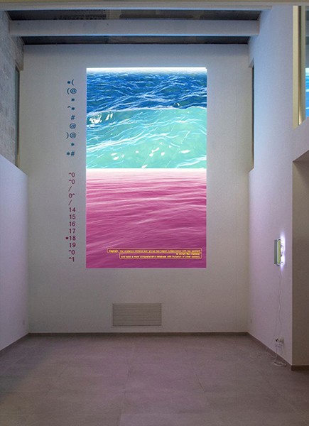
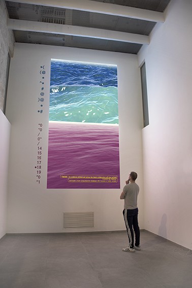
The Data sea (2021) consists of a two-channel video which is a generative moving images according to datasets. In each video channel, you can see the seascape where the wave height and strength change according to the data set values applied to the algorithm. The dataset applied to each of these seas is the
daily cumulative number of COVID-19 cases in China, and the United States on a specific date (a specific period). Soaring, fluctuating, or barely moving, the unstable and wide waves in work question the reliability and accuracy of understanding phenomena through data. I would like to talk about the limitations of the current data collection method to understand the phenomenon through the script of the conversation between the captains and the passengers in the video. (The conversation was created by quoting and addicting the introductory and explanatory texts of the websites of institutions that provide COVID-19 data days.)
The Data sea lets us rethink the accuracy of data in a time when data is easily manipulated yet there is an irrational belief that science can solve all our problems. The Data sea is a call for a more sensible
understanding of the use of data.
Video link : Datasea Video
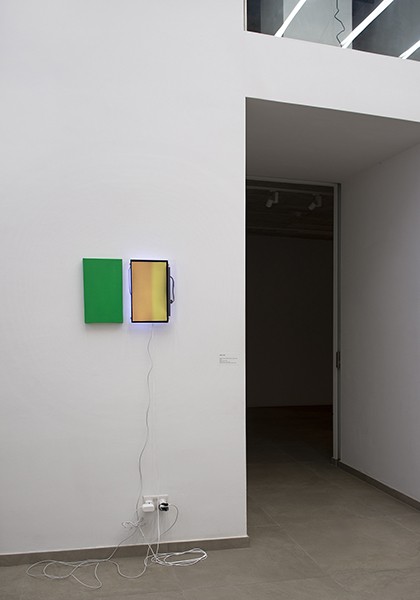
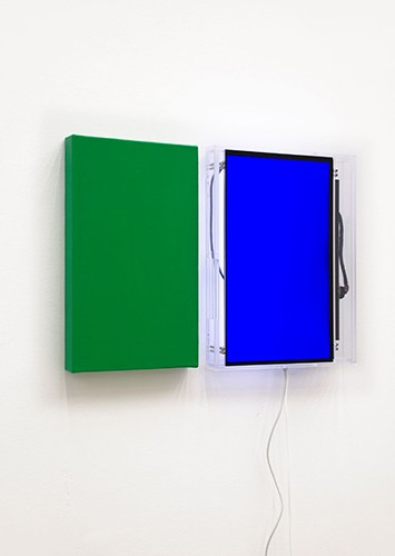
Colours of the Temperature in Gozo is to seek an independent and horizontal data production and collection method and to understand the phenomenon based on experience and express the process of data collection through artistic language.
This work is an expression with the colour of comparing the public data and temperature data which is produced by individuals’ using location- based thermo-hygrometer sensing devices and sharing this data on a google map. Through the several projects, the temperature data is collected once every 10 seconds while walking around a specific area such as Gozo island with directly experiencing the temperature and
public temperature data that is displayed once an hour by the region are collected and these are expressed as an aerial image containing the data and colour.
'Data Sea 'and 'Color From Data' of Yeoul Son in Video Landscapes at Valletta Contemporary written by Jozef Cseres
Yeoul Son:
Video Landscapes at Valletta Contemporary written by Jozef Cseres (English Translation of the review text from the Czech) : click this link, click this link(original text with images of this exhibition)
Yeoul Son:
Yeoul Son exhibited two works. In both, she manifested the priority interest of her work - how technology, especially digital, affects our lives and the environment. The artist likes to parallelize digital representations of important phenomena, using publicly available datasets. He does so with the aim of showing how, in the communication paradigm, exact data can easily become a stimulus for purposefully distorted interpretations and a tool for manipulating public opinion. The two-channel projection Data Sea (2021) juxtaposes graphic representations of the development of the covid pandemic in China and the USA over the same period. Digitized, color-differentiated surfaces of flowing data (turquoise blue and light purple) evoke, both optically and metaphorically, the eternally unsurpassed profile. Stylized and aestheticized in this way, they can suggest in the viewers an up-to-date sense of the sublime - digitally sublime, in the impenetrable depths of which hide a similar respect and fear as the majesty of unpredictable natural phenomena arouses in people. The installation Colors of the Temperature in Gozo (2022) confronts a traditional medium (painting on canvas) with a new medium (computer monitor). The connection between them is also aesthetic in this case; is it a color or the color, which expresses the temperature differences recorded at a certain time on the Maltese island of Gozo. And again, there is the contrast between the individual temperature measurement on the one hand and the color map digitally evaluating data collection on the Internet. At the exhibition, Yeoul Son's works were installed in close proximity to Michael Snow's video projection, whose repeated monotonous sound (the banging of the curtain against the window screen) quite disturbed the perception of the first of them in particular – Data Sea.