 24.46.50.97 Exhibition
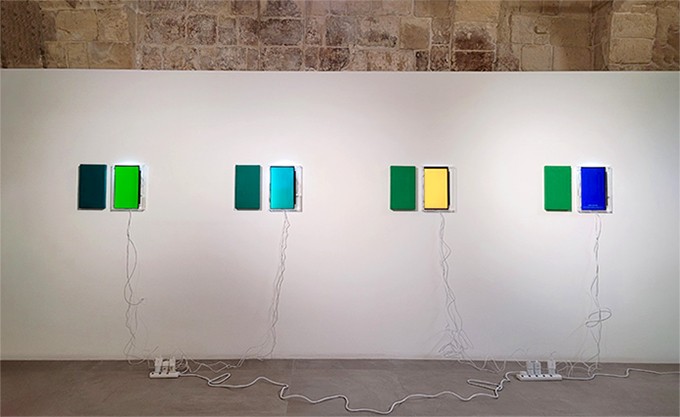
 Color from Data
 Color from Data (temperature data in Venice, Valletta, Gozo, Mt. Hanlla), multi midea, 38x27.5x3.5(cm), 2021- 2022
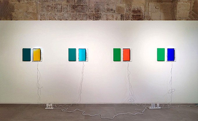
 Color from Data
 Color from Data (temperature data in Venice, Valletta, Gozo, Mt. Hanlla), multi midea, 38x27.5x3.5(cm), 2021- 2022
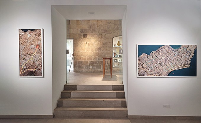
 Data Drawing
 Data Drawing in Gozo, digital printing ,55x115(cm), 2021
Data Drawing in Valletta, digital printing, 140x77(cm),2022
Over the past decade, I have developed a keen interest in exploring the coexistence of humans and technology. Consequently, my recent focus has been on creating artworks derived from data, particularly in the context of the Anthropocene, the geological term referring to present era when human impact on the Earth. The most hotly discussed topic of the Anthropocene is environmental issues such as global warming and high-tech under the logic of advanced capitalism. These discussion centres on the problems in the process of converting phenomena into data. In his lecture, Bruno Latour criticized the unwavering belief in science’s ability to solve every problem through technology. This belief also extends to the idea that digitizing Earth’s information can capture and predict various phenomena. Latour emphasized the vital role of artists and intellectuals in expressing phenomena through data.
My artistic journey begins with a critical examination of the process of converting phenomena to data. I contemplate about the way or process of comprehension of phenomena with data and technology.
In the “Colors from Data” project, I collect humidity and temperature data at various locations every 10 seconds over the course of an hour using a wearable location-based sensing device. I then translate this data into colors and share it through Google Map. The transformed color data is presented through monitors. As a point of comparison, I also represent the color data derived from public weather information for the same time and location on a canvas.
“data Drawing”, which is a series derived from “Colors from Data”, involves a drawing practice on Google Maps with colored points created from real-time temperature dataset uploaded and collected while roaming around the place to collect it.
Through the Color from Data Series, I explore the possibility of enjoyment with color and the wider and more various perspectives in ways to understand phenomena through data blurring the boundaries between public and private, experts and non-experts, specific and average and subjective and objective use of data.